Table of Contents Page
Created a Table of Contents Page for the Chronicle of Art and Design. Used Adobe InDesign to lay out the images and typography. Colors for the text were sampled from the pictures on the page. Below are two versions of the page.
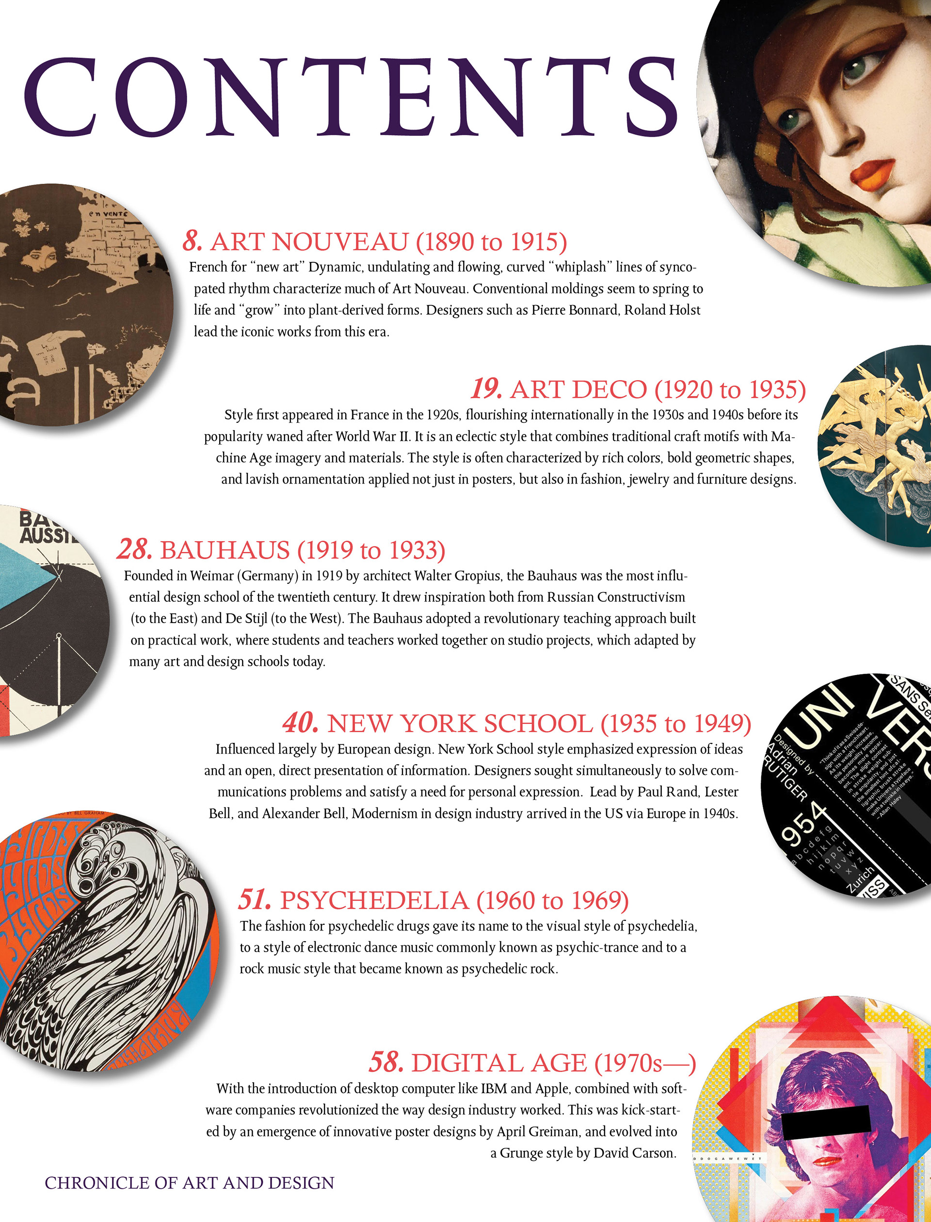
The piece used circular elements in order to lead the eye of the viewer around the page, especially with the image of "Young Lady with Gloves" by Tamara de Lempicka in the top right pointing towards the word "Contents".
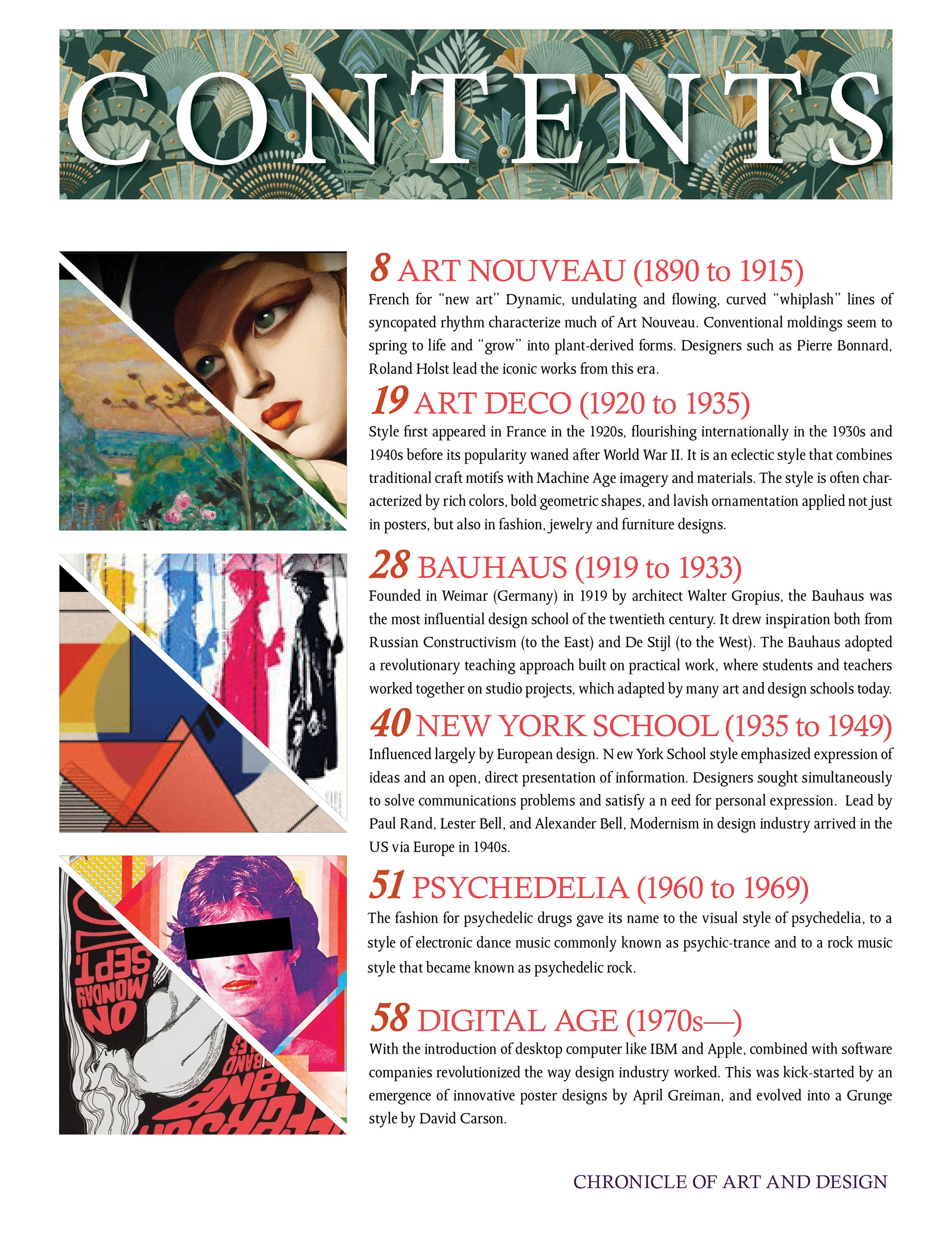
This version is more focused on square images rather than circles and has more alignment to them than the previous paper. There is also an added Art Decor masthead at the top of the page.
Magazine Spread
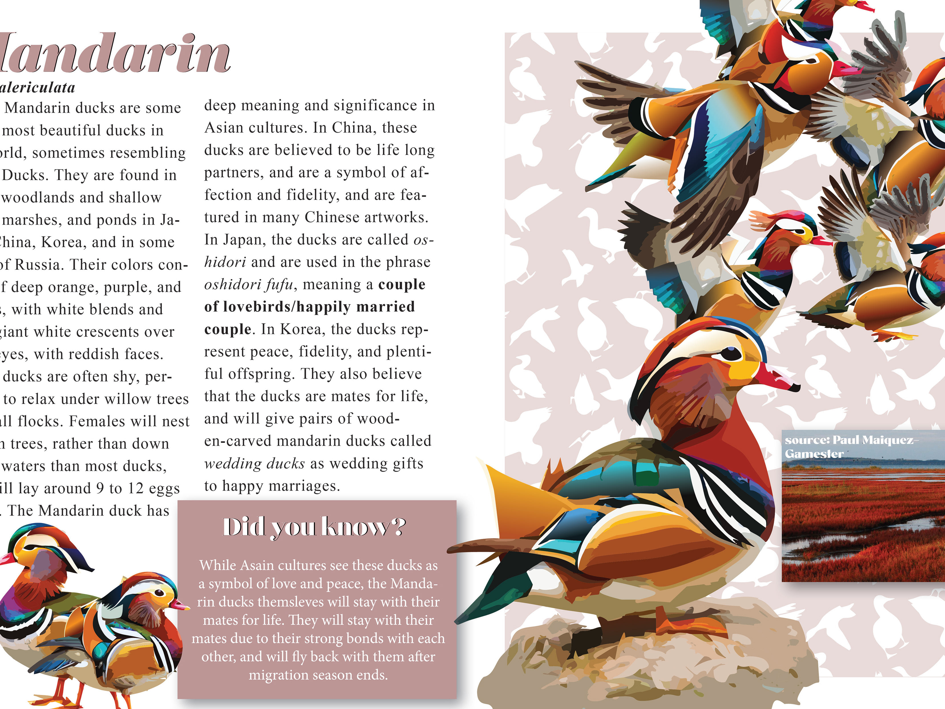
A spread made in InDesign, with the images being touched up in Photoshop. Only two spot colors were used in the project, which is black and red. The magazine is based on the differences between working as a Freelancer and as an Agency worker in the graphic design field.
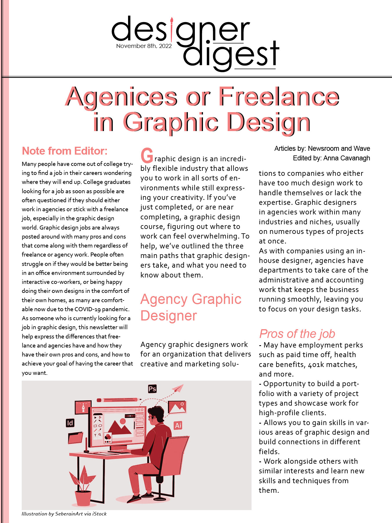
Page 1. Masthead design made in Illustrator.
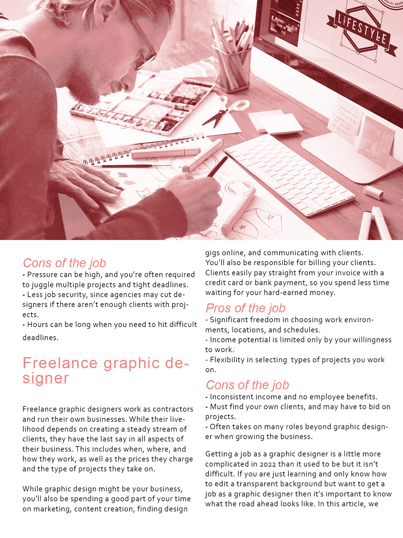
Page 2

Page 3
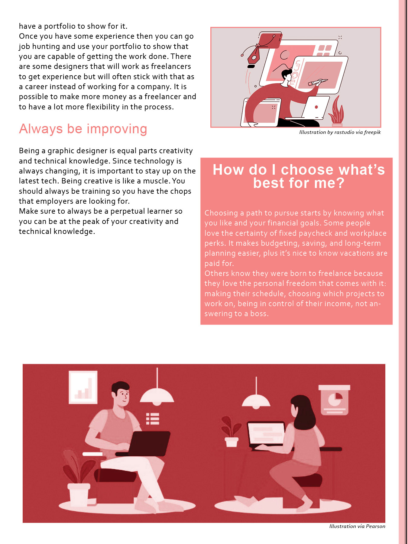
Page 4
TIME Magazine Cover
A custom cover for TIME Magazine. The cover is based on America's ever-changing health care costs. The background image of the arm casts was created using Photoshop and the typography was made and edited in InDesign.
Arm casts have flags from different countries on them to show the different representation that other counties have over America.
Senior Project in Visual Arts Poster
Poster for Stockton University's Spring 2024 BFA Senior Exhibition. Background has color blobs to give the black and bold text more emphasis and exaggeration. Created using Adobe Illustrator.
Threshold Elemental Posters
Advertisement posters created using Adobe Photoshop, showing the use of different threshold elements and colors. Below are some projects that show this effect, including the movie "Poor Things", "A Nightmare on Elm Street", and for the punk rock band Green Day's savior tour.
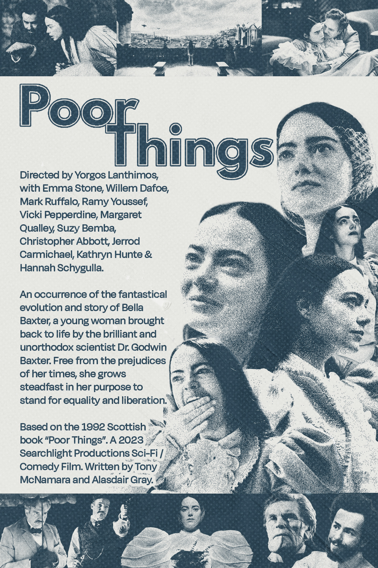
"Poor Things", directed by Yorgos Lathimos
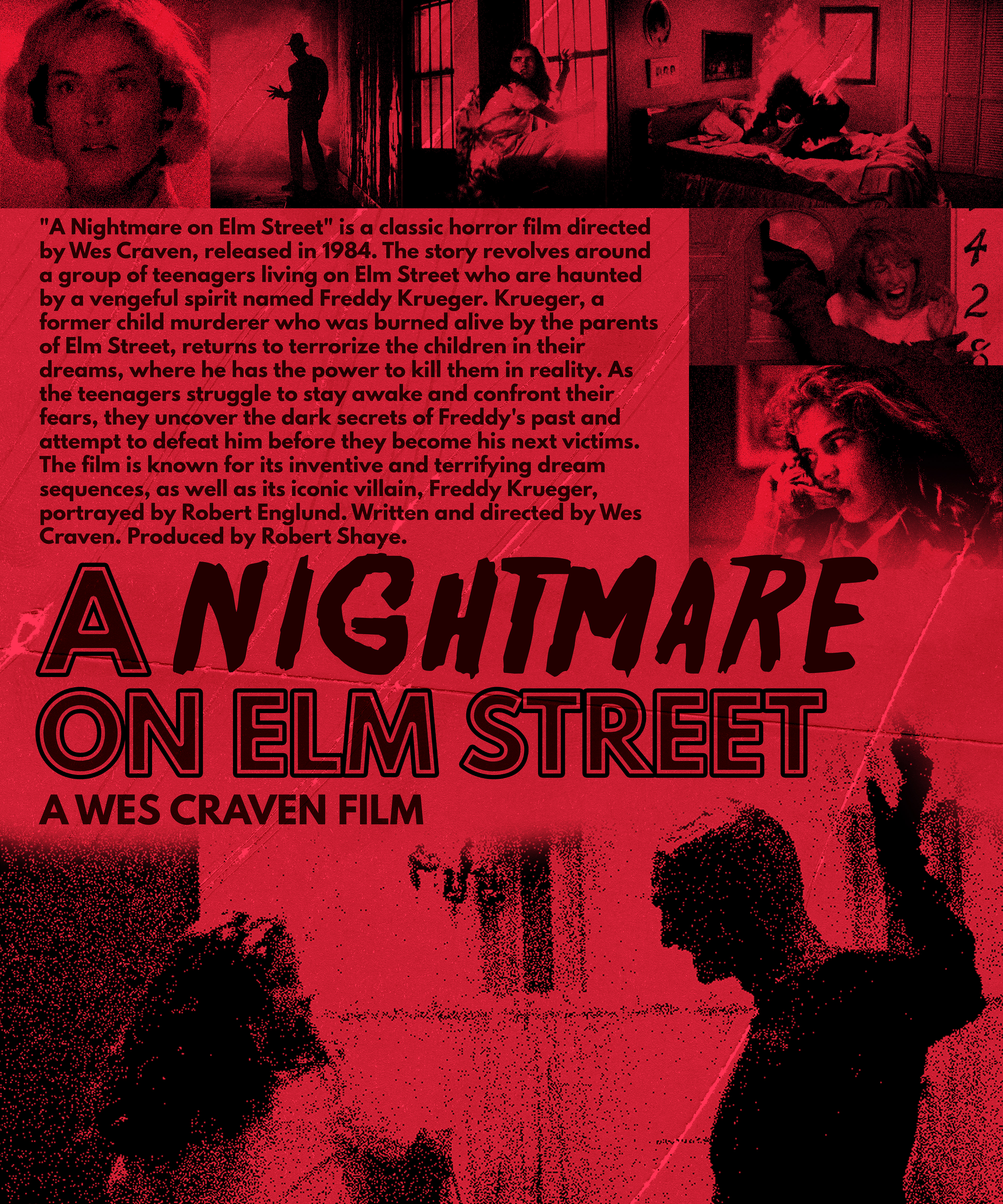
"A Nightmare on Elm Street", directed by Wes Craven
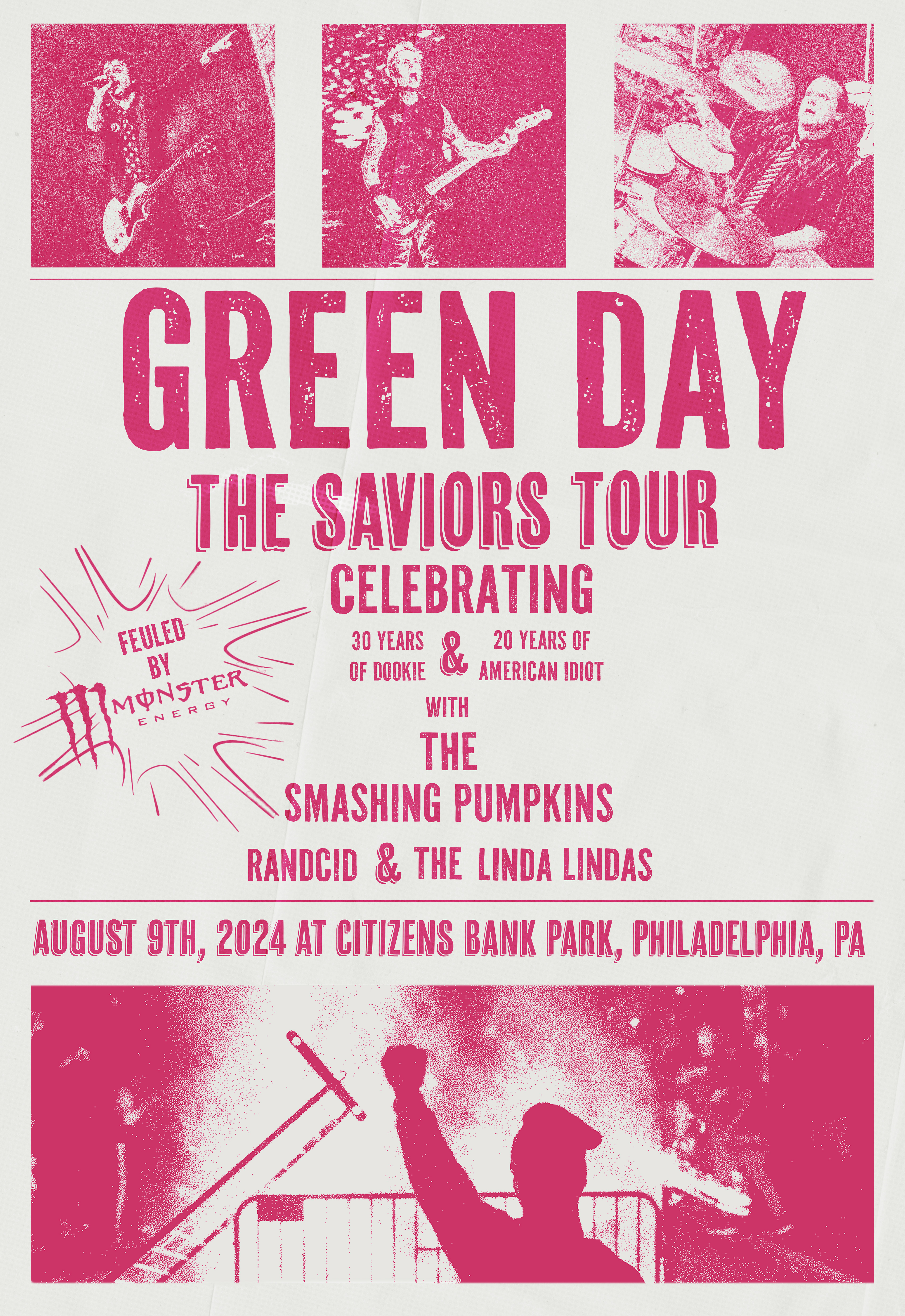
Green Day's 2024 Saviors Tour
Cultural Stamps
A stamp collection to showcase the diverse Italian American musicians from the silver screen era. Images were edited in Photoshop, while the typography and the stamp outline were created in InDesign
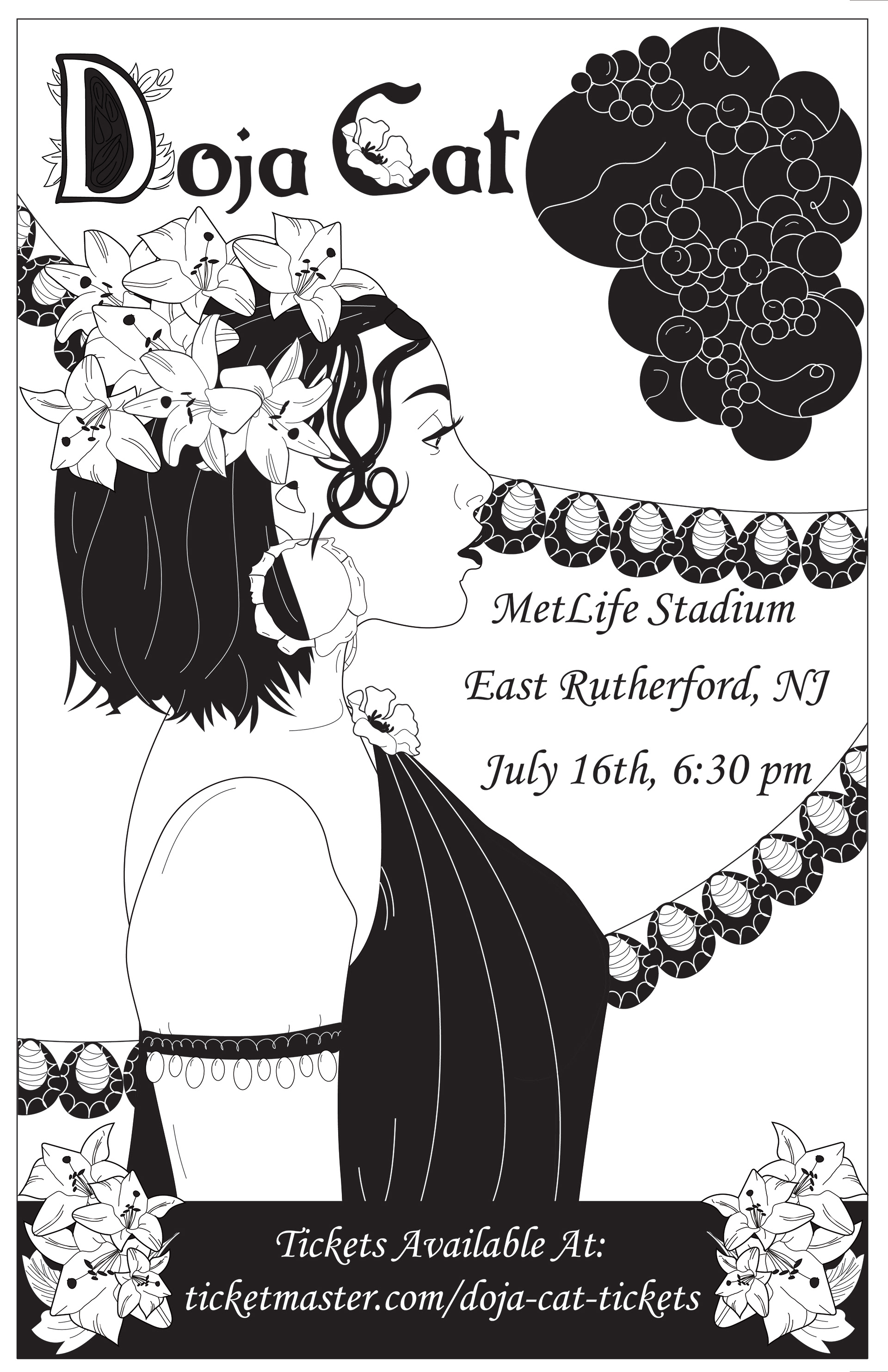
Doja Cat Musical Posters
Custom posters for Doja Cat's 2022 tour with The Weekend. Heavily inspired by Art Nouveau elements and created using Adobe Illustrator.
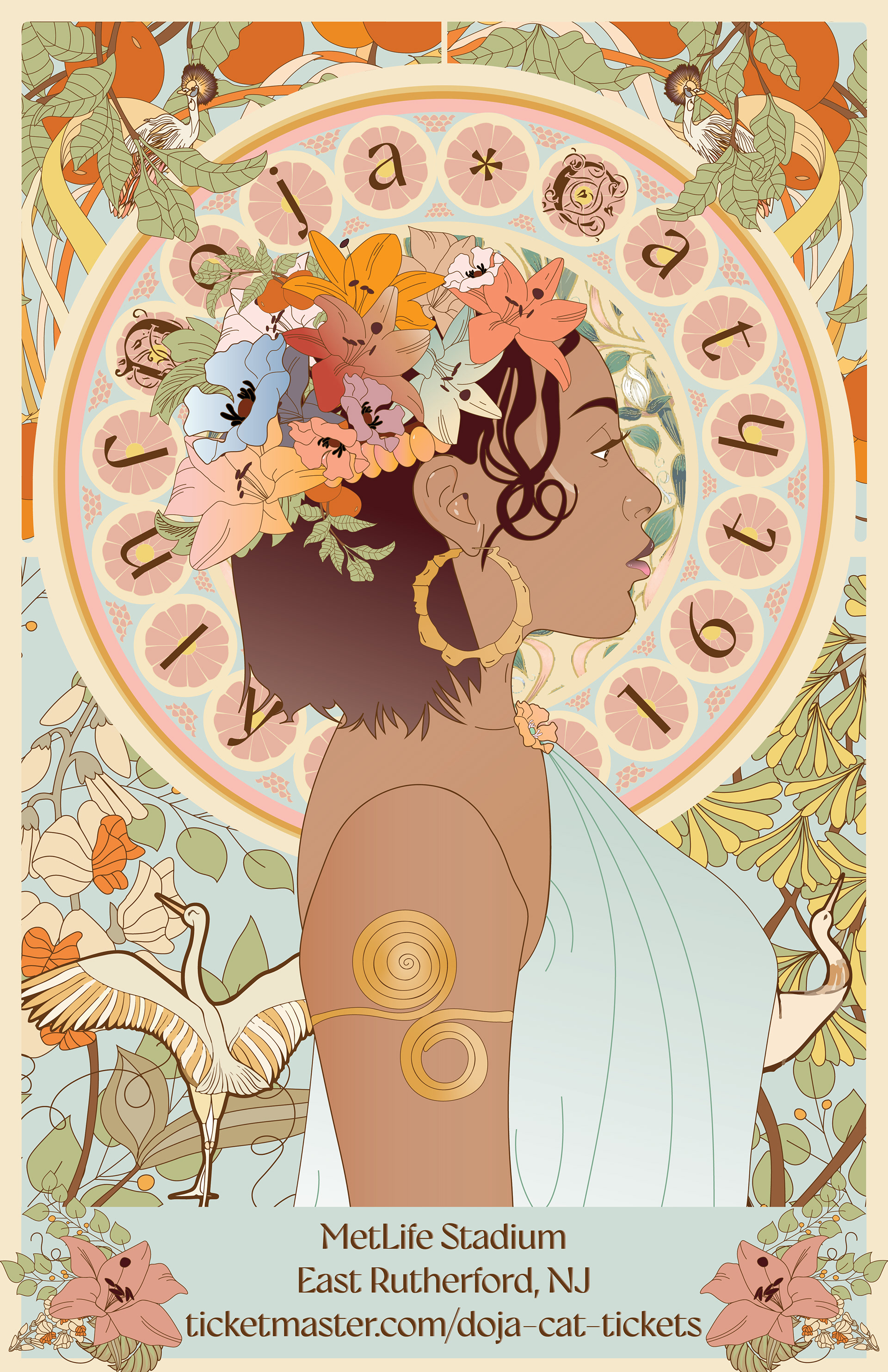
Colored Version
